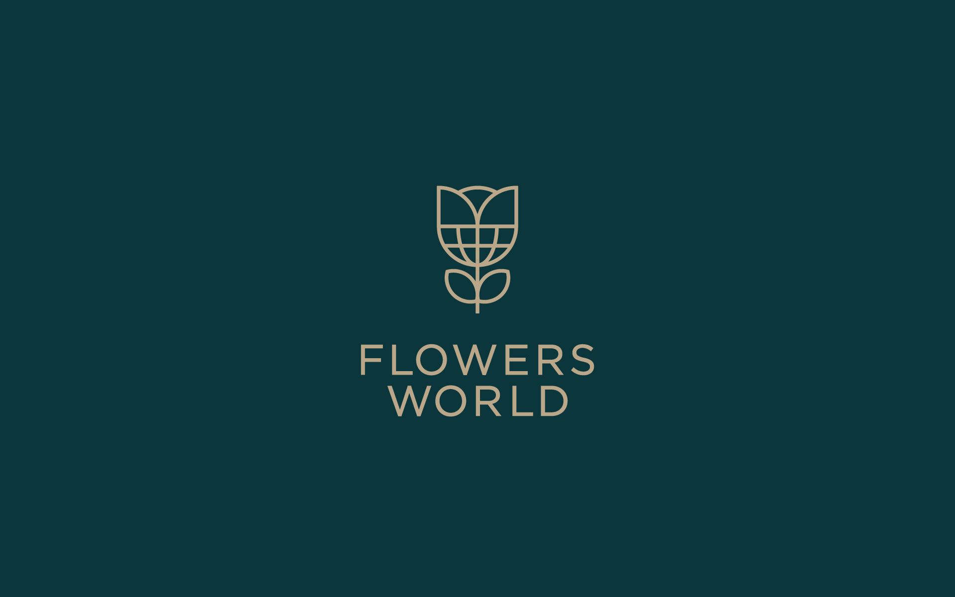
FLOWERS WORLD
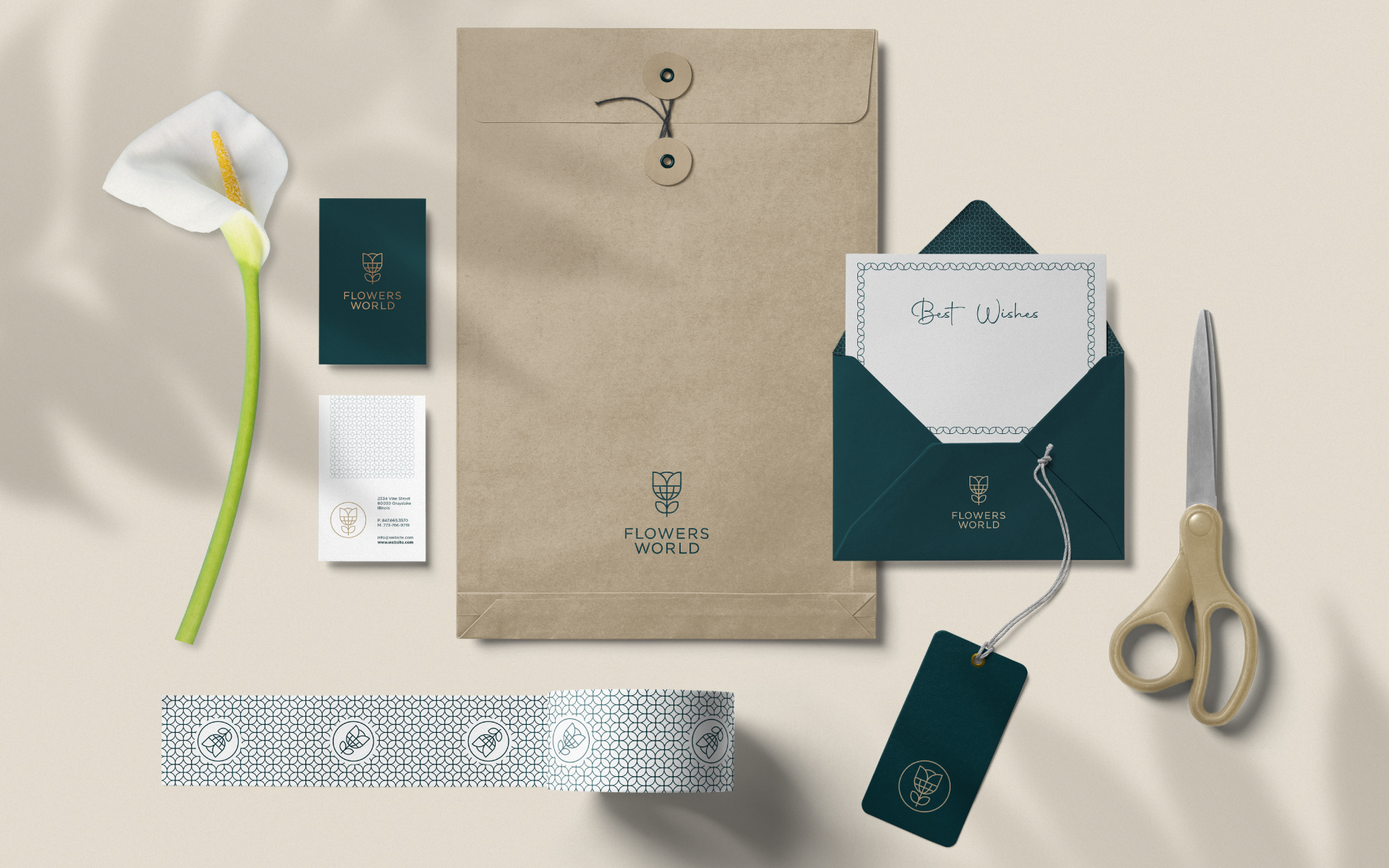
Flowers World is a small flower store, a quiet, cozy and sophisticated place to choose and create the perfect flower arrangement.
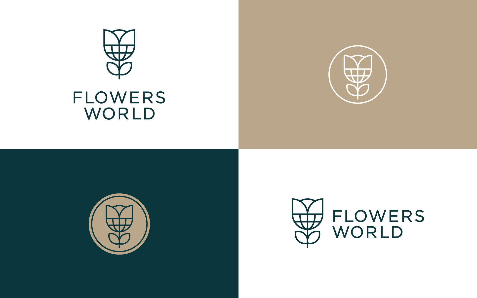
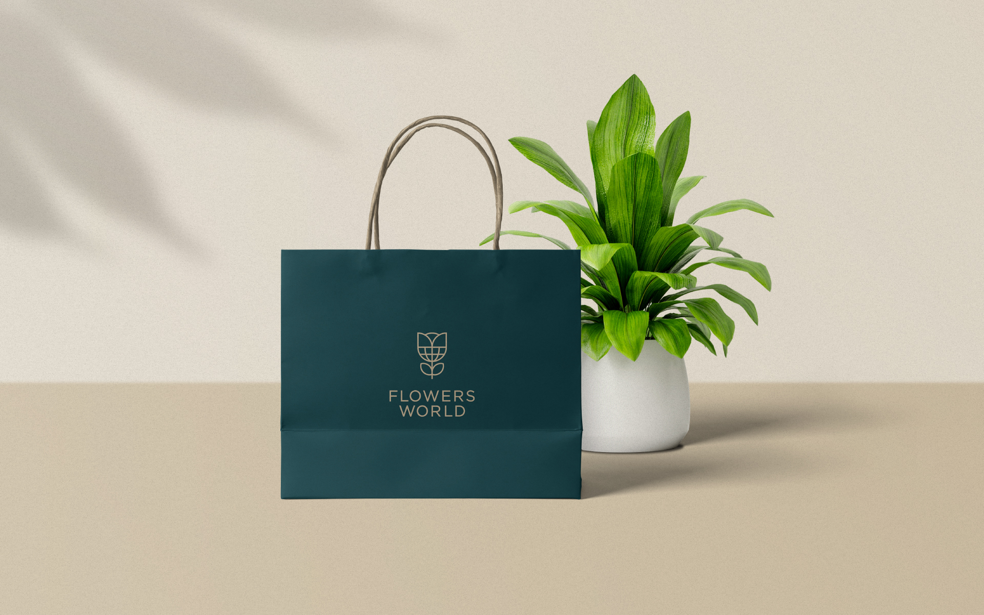
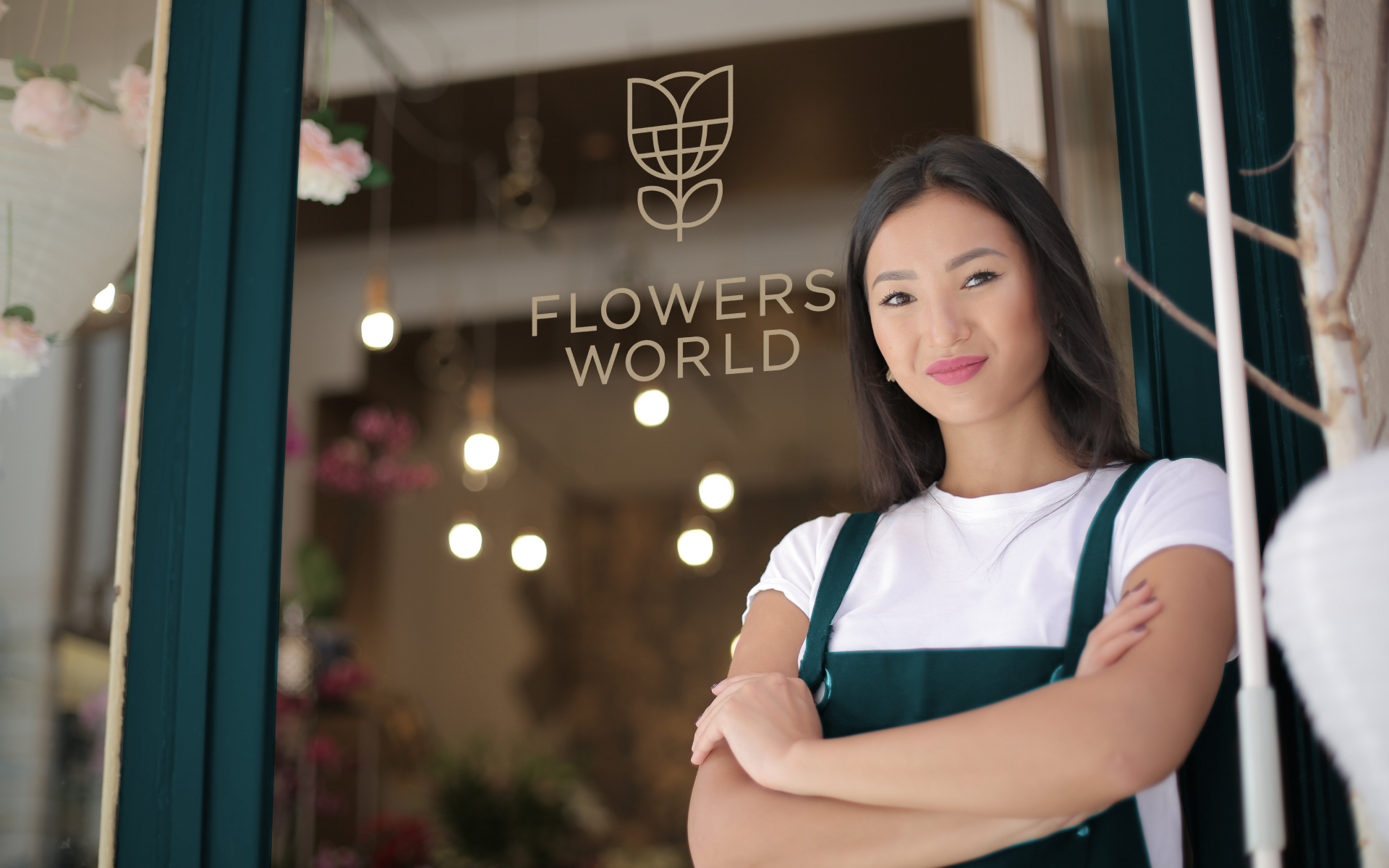
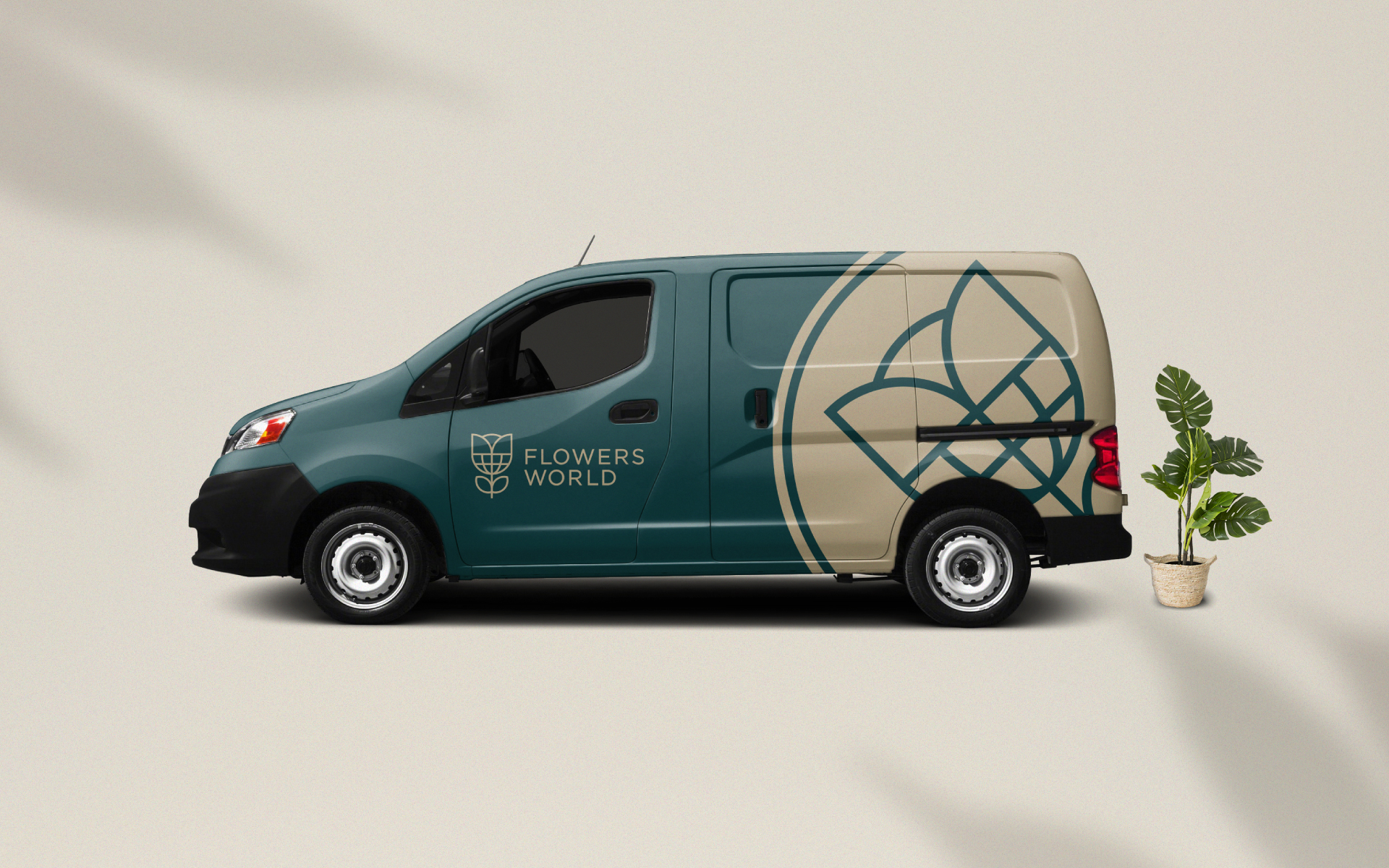
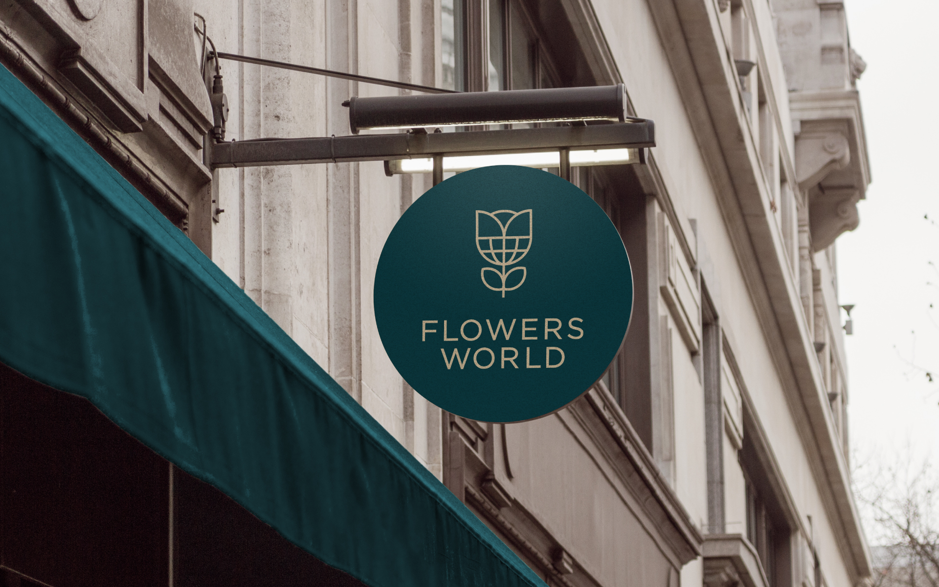
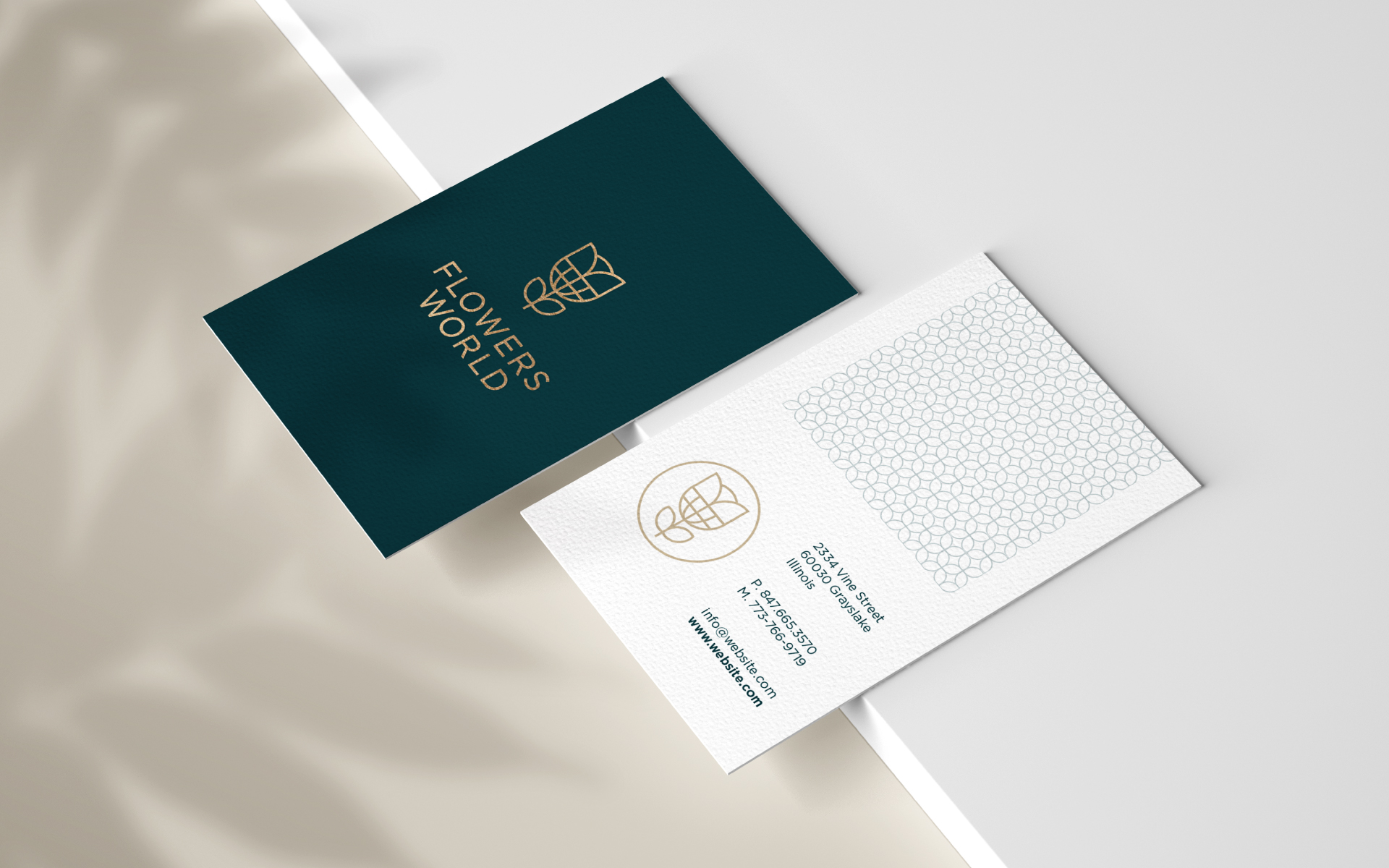
The goal was to have a logo and a color palette that represented the store and its mood, to be used mainly in the elements useful for flower arrangement and merchandising. The logo also had to lend itself to be used as a window sticker and sign, making the store visible from the outside and recognizable to passers-by.
As suggested by the name, the logo is composed of two elements: a flower (more precisely a tulip) and the world. The symbol has been represented with thin lines to communicate lightness, the same goes for the sans serif used as a typeface.
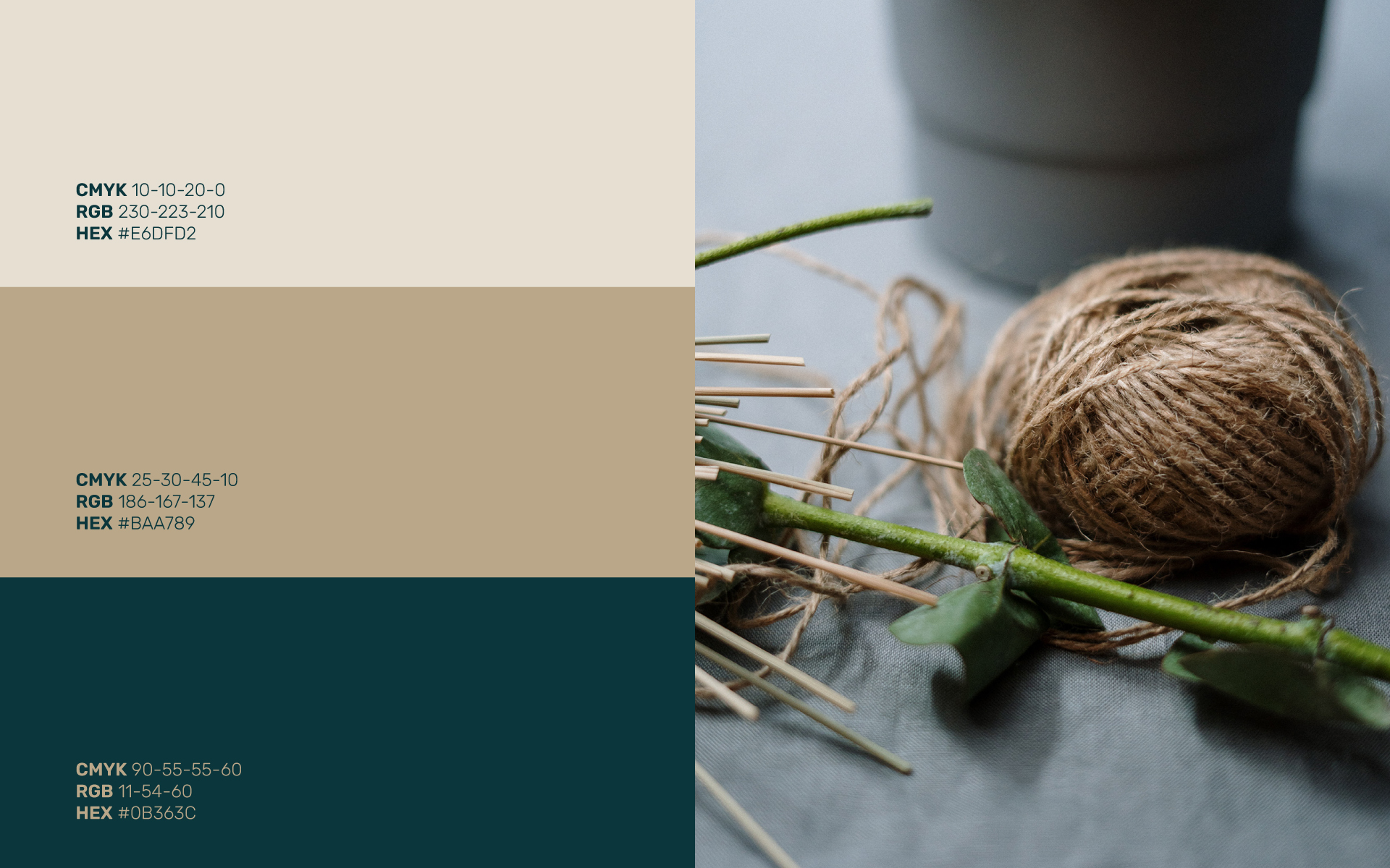
The color palette is composed of two main colors: beige/gold reminds of the ground and communicates refinement, while green is the color of nature par excellence and in this dark shade brings calm and elegance.