Project Brief
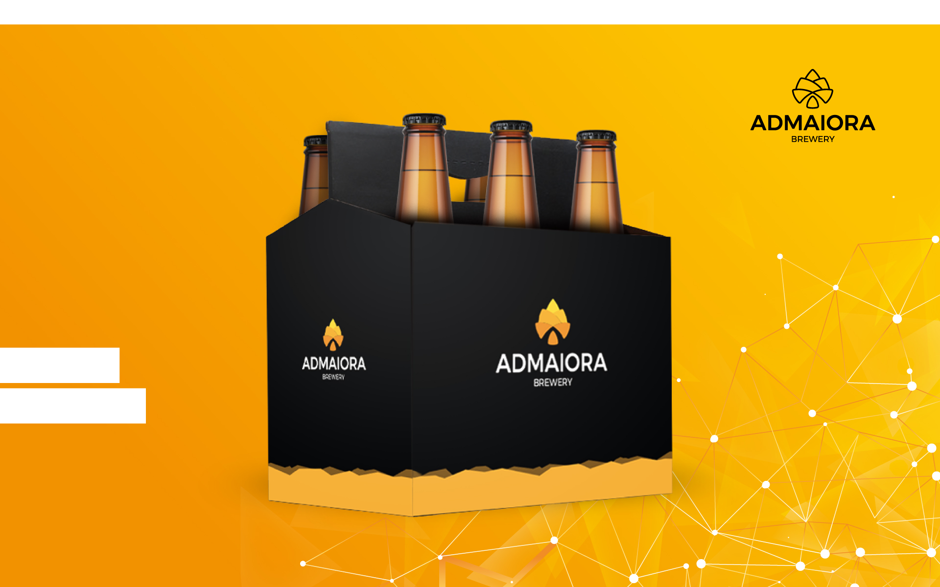
Admaiora is a microbrewery located in northern Italy, born from the passion for beer of two friends.
The brewery mainly produces three beers, with the aim of growing and expanding the production line.
The Challenge
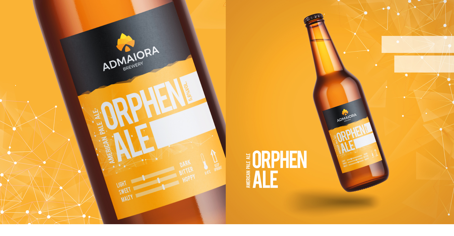
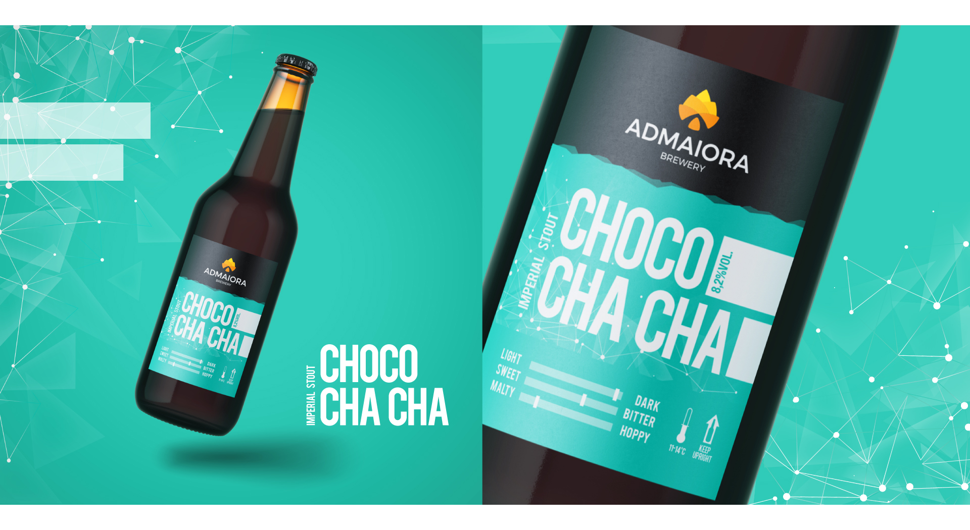
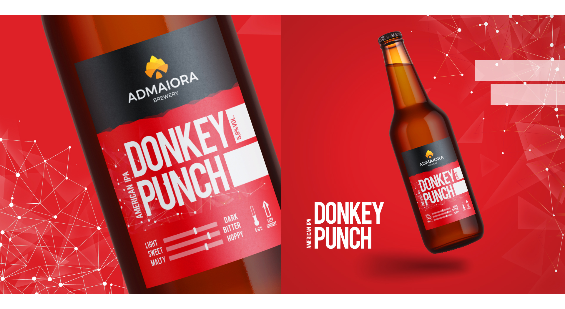
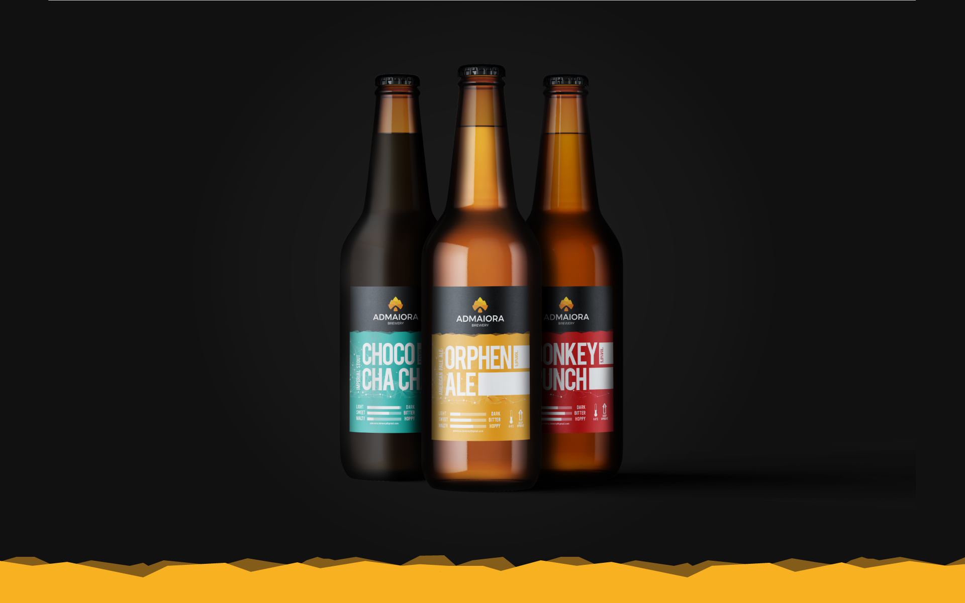
The need was to have a logo that would make it recognizable and the creation of three labels, one for each style of beer produced with the predisposition for a future extension of the line.
The Solution
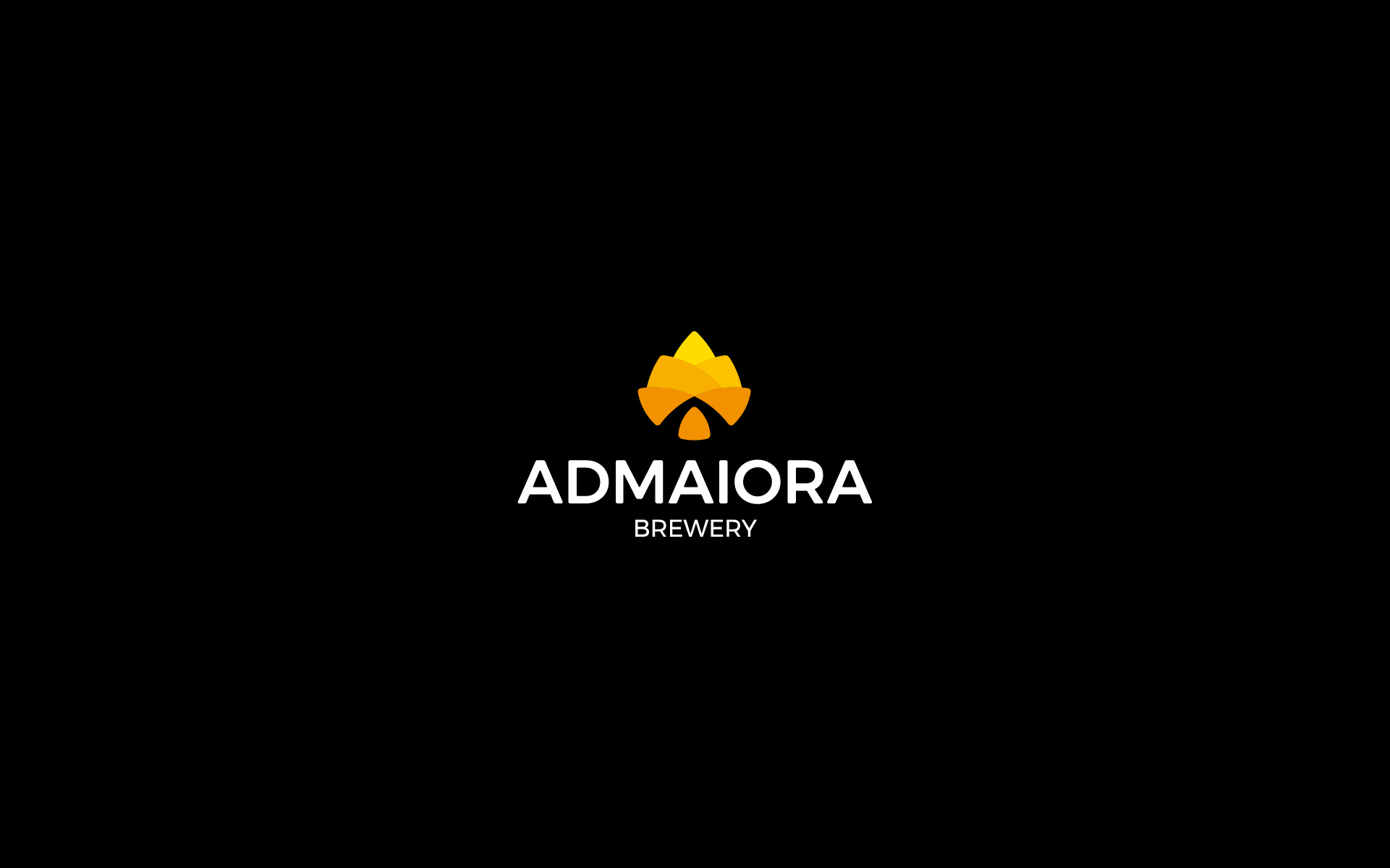
The logo represents a hops, as the main element for the production of beer. Inside, in the negative space, two converging lines represent growth and the letter A.
The chromatic choice of the logo recalls malt, beer and the warmth of the sun. To mark the identity, the labels aesthetically maintain a common line, differ mainly in color to be easily recognizable and distinguishable from each other.

